Terena. Turning a traditional specialist clinic into a digital service
At a glance
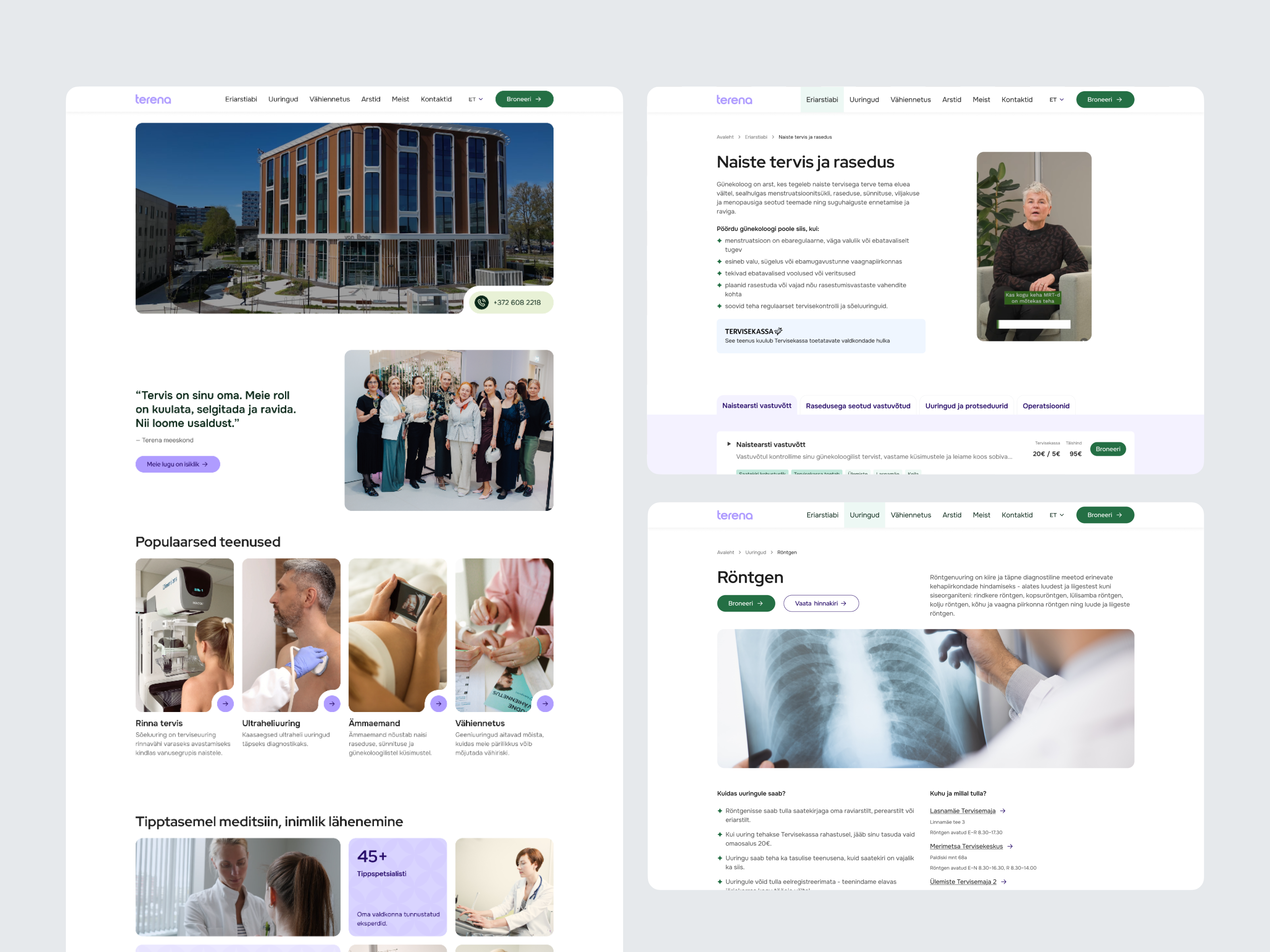
Terena is a private specialist medical clinic in Estonia. The project replaced a standard brochure site with a new digital product structured around the clinic’s actual services, specialists and locations. The new product needed to support the clinic as it grew, while also preparing the patient journey for future integration with an external booking system.
The challenge
Before the project, Terena operated as Tallinna Eriarstikeskus and had a simple informational website with descriptions of medical specialties, a price list and basic information about the clinic. There was no real service structure or online booking journey.
The challenge was to create that structure from scratch: connect medical directions, individual services, specialists and multiple locations in a way that could grow with the clinic and later connect to an external booking platform.
At the same time, Tallinna Eriarstikeskus was becoming Terena, with a new name and visual identity.
Outcome
A new brand and digital product built around reusable page templates, a structured service offering and a scalable design system. The website is live and prepared for integration with the external booking platform.
Project stages
- Understanding the healthcare problem
- Translating research findings into product principles
- Structuring services, specialists and locations
- Designing the path to booking
- Building the brand and component system
- Launch
Why medical websites usually fail their patients
During the research phase, it became clear that several failure patterns repeat across the healthcare category with striking consistency.
Medical websites carry two obligations that tend to work against each other. The first is comprehensive clinical accuracy, since the content describes procedures with real consequences. The second is immediate comprehension for a lay reader who is often navigating the site in a state of stress. Most sites resolve this tension by defaulting to the first at the expense of the second: pages become dense, terminology remains clinical, and the patient is left to decode.
A second problem is structural. The information architecture of most medical sites mirrors the organisation of the clinic itself, arranged by department, specialty, or internal hierarchy. This is coherent for the institution but foreign to the patient, who arrives with a symptom or a concern rather than a departmental preference. The two vocabularies rarely map cleanly onto each other.
Doctor
Clinical language
- 🧑⚕️ Dermatological evaluation
- 🧑⚕️ Gastrointestinal discomfort
- 🧑⚕️ Lumbar pain
- 🧑⚕️ Otolaryngology consultation
Patient
Everyday language
- 🤕 I want to check a skin issue
- 🤕 My stomach hurts
- 🤕 My lower back hurts
- 🤕 Ear, nose and throat appointment
Design challenge
We were not redesigning an existing product structure. We had to create one. The new Terena website needed to organise a growing amount of information across medical directions, individual services, specialists and locations, while still being understandable to someone who does not know how the clinic is organised internally.
Every page required the same decisions:
- What does the patient need immediately?
- What can wait?
- What should expand in context?
- What actually needs its own page?
The structure also had to work across two hospital buildings and two additional locations, and eventually connect with an external booking system that followed its own service logic.
From research findings to design principles
Instead of treating every page as a separate design problem, I used a small set of principles across the product:
- Patients should not need to understand the clinic’s internal structure to find the right information.
- Essential information should appear before detailed medical content.
- Related services should be easy to compare without opening many separate pages.
- Longer information should appear only when the service genuinely requires it.
- A patient’s choice should carry into booking instead of making them start again.
These principles became the basis for the information architecture, page templates and component system.
Solution
1. Turning a price list into a service structure
Previously, the website mainly described broad medical specialties and provided a price list. For the new website, services needed to become part of the actual navigation and patient journey, so I structured them by medical direction and designed a system that could connect individual services with relevant specialists, locations, pricing and future booking.
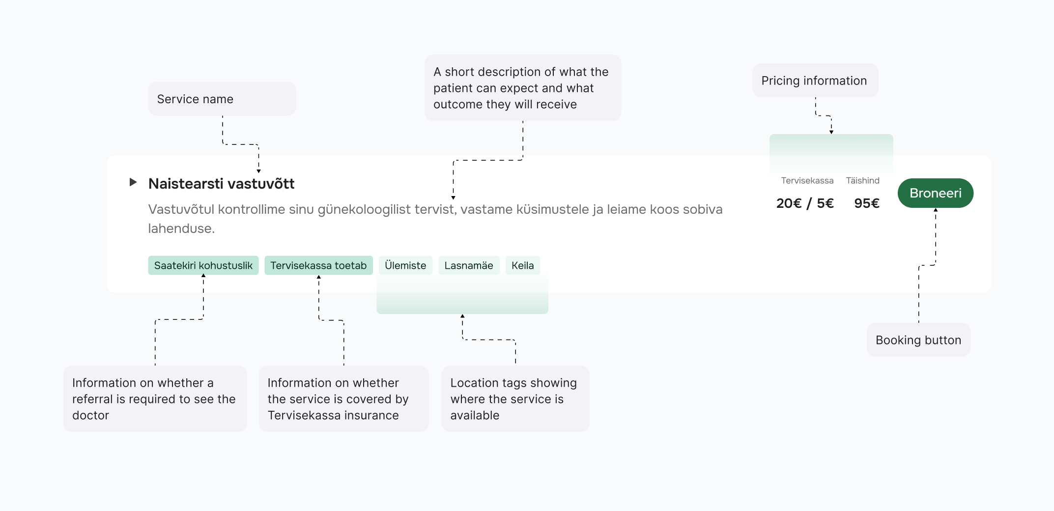
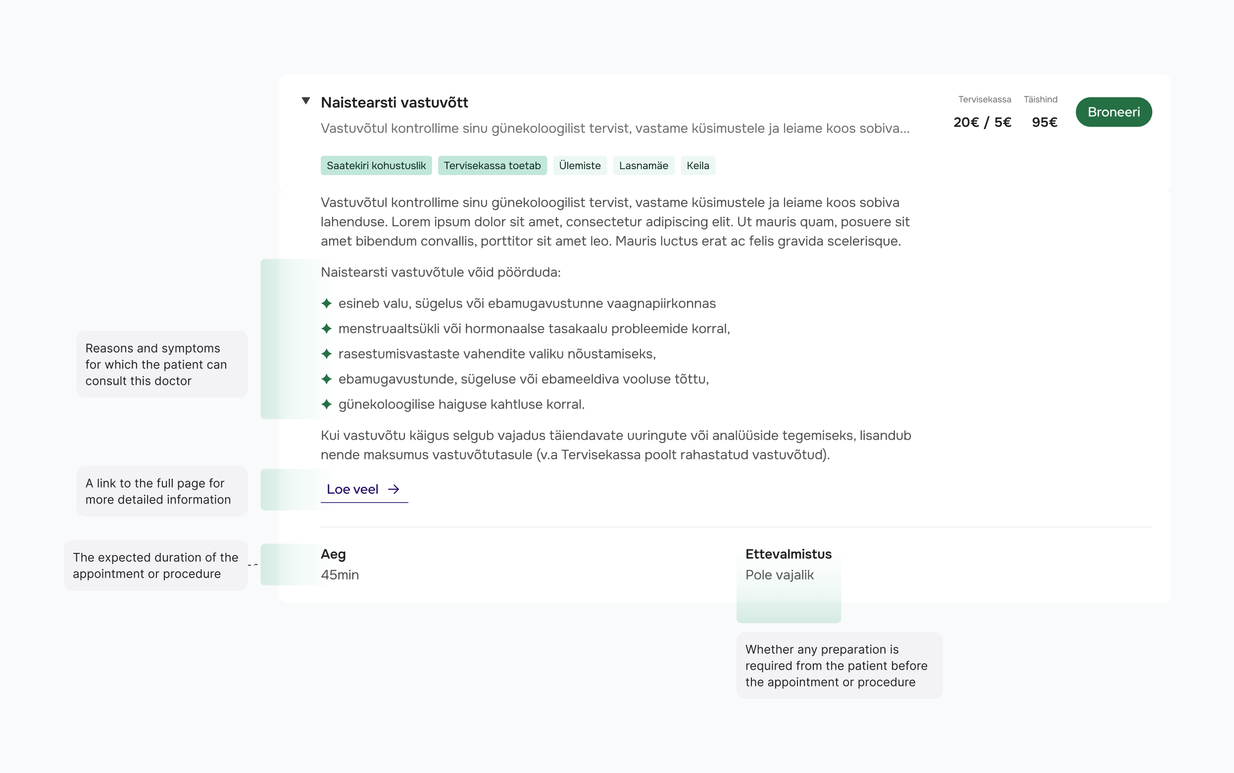
Related services are shown together as expandable cards. Before opening anything, the patient can already see the essential information: the service name, short explanation, price, duration, locations and booking action. More information expands directly inside the card, allowing the patient to stay in the same context while comparing services.
When a procedure genuinely requires a longer explanation, the card links to a dedicated page. This means the more complex case does not define the structure for every other service.
2. Designing templates before designing individual pages
Terena had many services, specialists and locations, and that content would continue to grow after launch. Designing every page individually would solve the current website but make future growth difficult, so I created reusable templates for each main page type.
The templates defined what information belongs on the page, its hierarchy, expected content length, what should appear first and when additional detail should be introduced. I also added placeholder copy to the templates, giving Terena’s team a practical content framework: not just what information they needed to provide, but approximately how much.
Medical content itself came from the clinic. Our role was to review it from the patient’s perspective and flag places where important information was difficult to find, terminology was unnecessarily complex or the amount of text worked against the hierarchy.
.png)
3. Designing booking before the integration existed
Online booking is handled by an external partner platform. The main challenge was to understand how Terena organised its services, how those same services were defined in Estonia’s medical system with their own classifications and service codes, and how the booking partner structured them on its side. We needed to find a middle ground between these systems that would still make sense to a patient: what they are choosing, what they are booking and what will happen next.
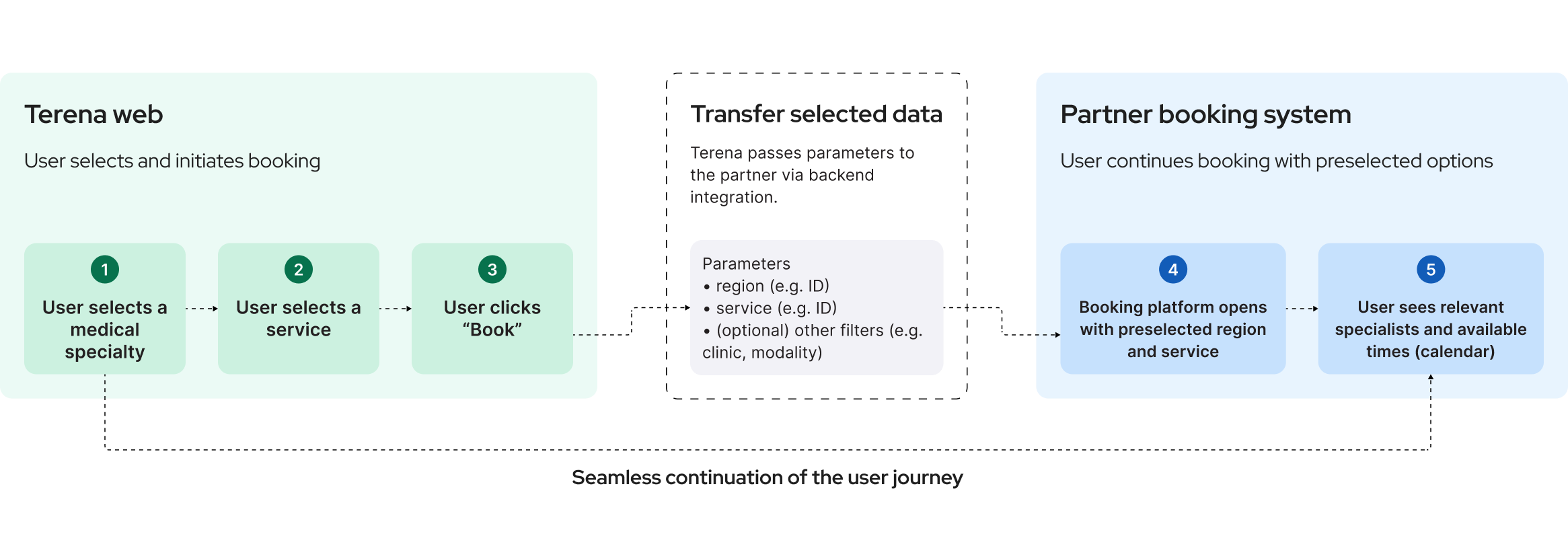
I designed the user path so that a choice made on Terena could eventually carry into the booking system. If a patient chooses a specific service, that service can already be selected when the booking platform opens, allowing them to continue to a suitable time or specialist instead of searching for the same service again.
Developers were involved from the structure stage to validate technical feasibility early and make sure the decisions we were making would also work with the future booking integration. The goal was not to reproduce the booking platform inside the website, but to make the transition between the two systems feel like one continuous journey.
4. Treating accessibility as part of the product
Accessibility was considered from the beginning rather than added after the UI was finished. This mattered especially in healthcare, where the audience can include older patients, people with low vision and people trying to understand unfamiliar information while already under cognitive or emotional stress.
The interface uses clear hierarchy, readable typography, predictable interaction patterns and accessible contrast. Progressive disclosure also helps here: the patient can find the main information first instead of processing a full medical description before understanding the service.
5. Building a new identity together with the product
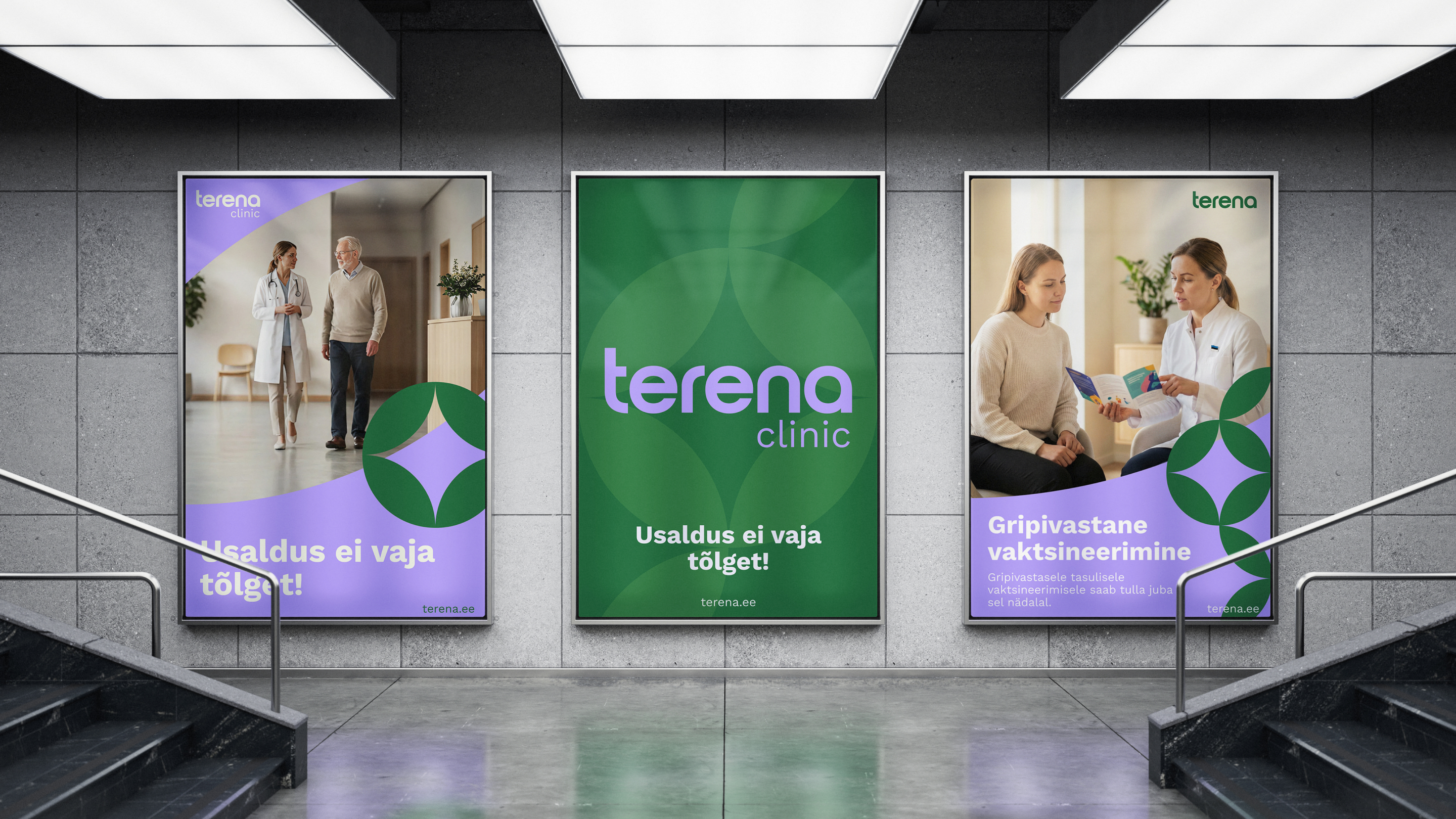
The website was created alongside a complete transition from Tallinna Eriarstikeskus to Terena. The new name was developed together with the founders, while marketing and brand specialists worked on the wider brand strategy. I designed the visual identity, including the logo, colour palette and typography, and translated it into the digital product.
The visual direction uses soft greens and light lilac tones instead of the cold visual language common in healthcare. Photography focuses on real people and warmer environments, and where possible, service pages also show the equipment patients will encounter during a procedure. The brand and product were therefore developed as parts of the same experience rather than as two separate layers.

What was built
- Information architecture and user flows across the full site
- Reusable page templates with content structure and guidelines
- Service structure with expandable content and clear relationships between services, specialists and locations
- A booking journey designed to carry the patient’s choices into the external booking platform
- Complete responsive UI, design system and developer handoff, with developers involved throughout implementation
Tallinna Eriarstikeskus evolved from a simple informational website and price list into a new brand and a structured digital service connecting medical directions, services, specialists and locations.