SQENCE. A real-time social network built on one rule: post first, see after.
Sqence was built against the logic of most social apps. No filters, no gallery uploads, no editing. A photo had to be taken now, in the moment, or not at all.
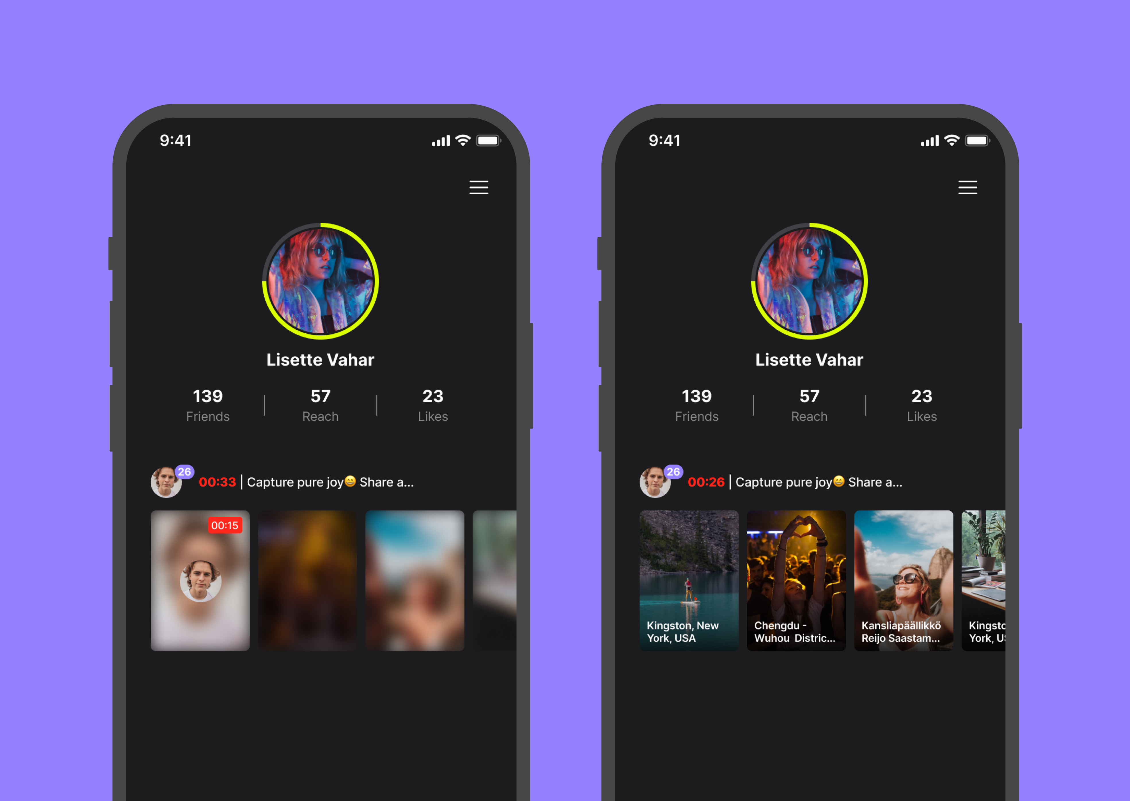
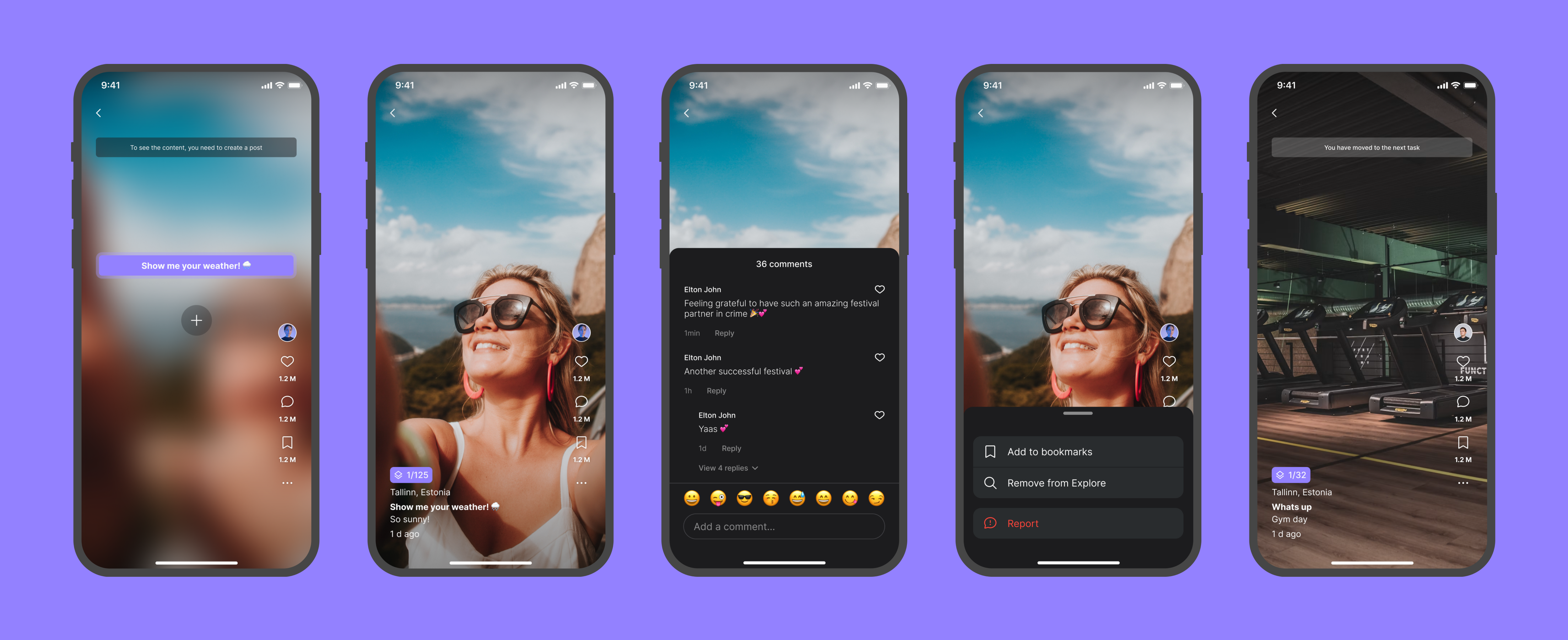
The core mechanic was a sequence. Someone starts it with a photo and a short prompt, "Show me your weather," "Capture pure joy," and sends it on. Whoever receives it has one hour to capture their own photo before they can see it, and that same prompt carries forward to everyone who joins the sequence after them. Everyone else's photos stay blurred until you contribute your own. BeReal was the closest thing on the market, but the sequence structure, one prompt tying a chain of photos together, was Sqence's own.
Photos could be liked, commented on, and saved to favorites, the same as any social app. What made Sqence different was what stood in front of that: nothing was visible until you had already participated.
Turning the founder’s idea into a buildable product
The concept came from the founder, but it lived mostly in his head. There was a raw flow, minimal, just enough to explain the app's logic, but no real spec and no defined edge cases. The build timeline was short, and there was no room for a conventional research phase.
Most of the early work was not inventing new ideas. It was asking the questions that turned a founder's mental model into something buildable: what happens if a friend doesn't respond in time, what a profile shows before you've posted anything, what disappears and when. The founder held the vision. The job was to walk through it with him until nothing was left assumed.
Designing around a strict capture model
The constraint was strict by design:
- No access to camera roll
- No editing, only recapture
- One hour to respond from the moment a friend sends a prompt
- Front and back camera, digital zoom, and video capture, nothing else
Every screen after that had to work within those limits. Camera, navigation, and profile were kept as close to native patterns as possible, so the only thing asking for the user's attention was the capture itself.
Using familiar patterns for an unfamiliar content model
Content was browsed the way short-form video is: swipe up to move through the current sequence's stack, one photo at a time. Reaching the end of that stack moved you into the next sequence automatically. Swiping left worked as a shortcut past that, jumping straight to a different sequence. Either way, a small message, "You had moved to the next sequence," told the user the topic had changed. The browsing model borrowed from something people already knew, TikTok, Reels, but repurposed for a very different content structure.
Ephemeral by default
Nothing in Sqence was meant to last. Sequences and their photos expired within a set window. Favorites was the one place content could be kept, and even there, removing something deleted it permanently.
Onboarding: what didn't work
The first version walked a new user through creating their first sequence step by step. It was a full guided flow, mandatory, with no way to skip. Testing showed it backfired. People found it too long, and being unable to skip it made things worse, not better. It was dropped entirely and replaced with two lightweight cues: a swipe hint lasting a second or two, and the mascot pointing at the post button. Neither gets in anyone's way. That worked.
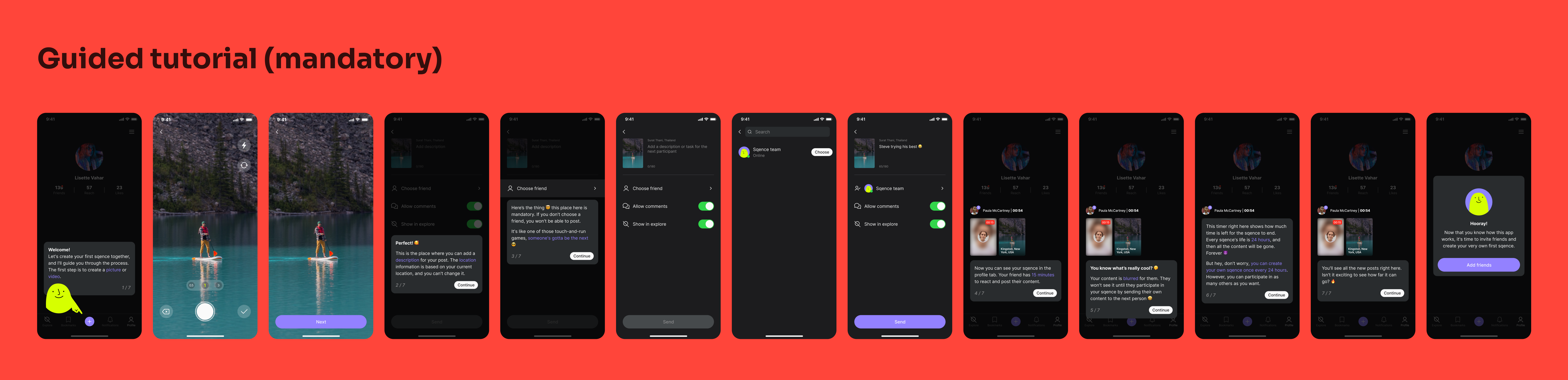
The first version: a mandatory step-by-step walkthrough, with no way to skip
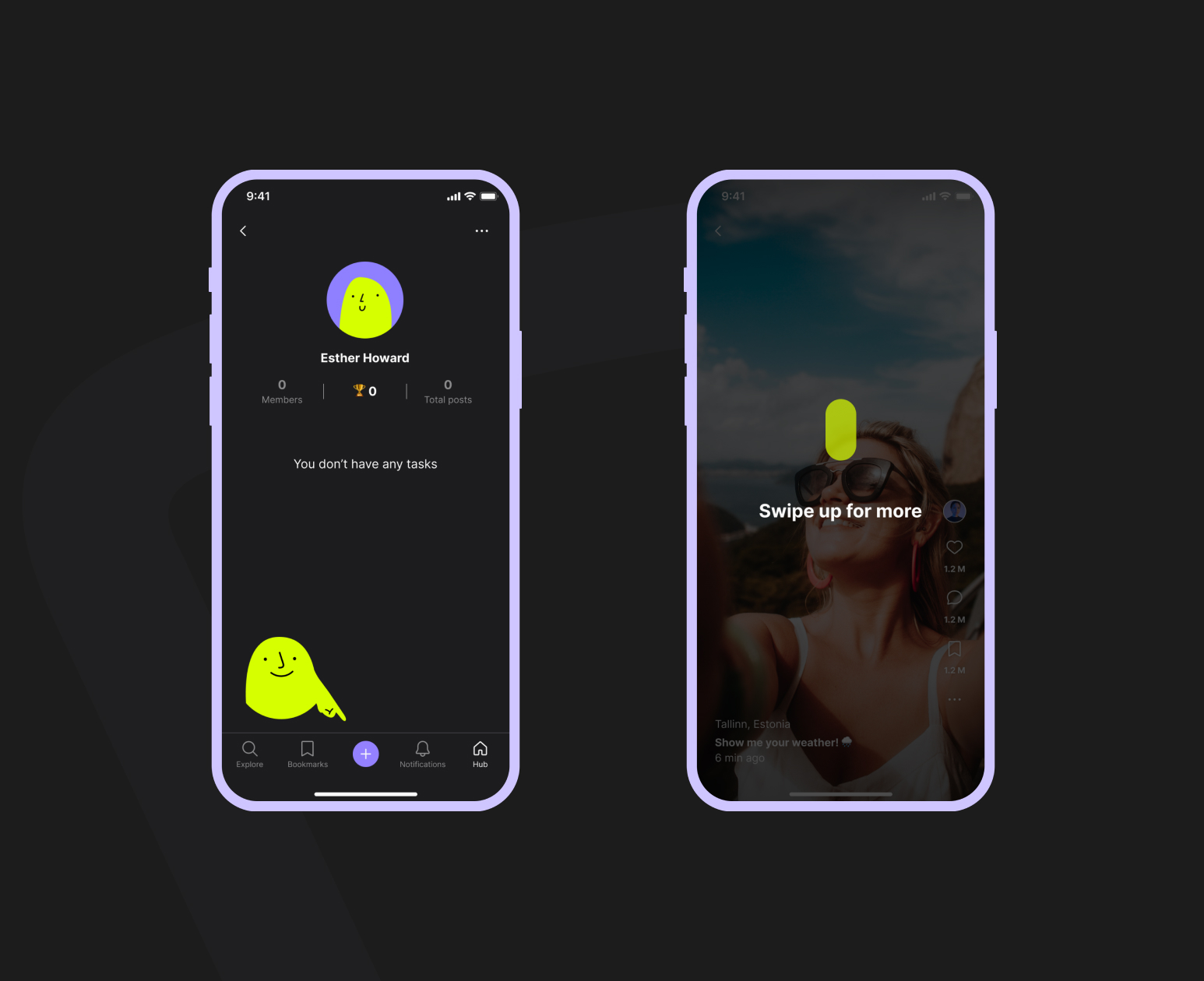
What replaced it: a swipe hint lasting a second or two, and the mascot
The mascot
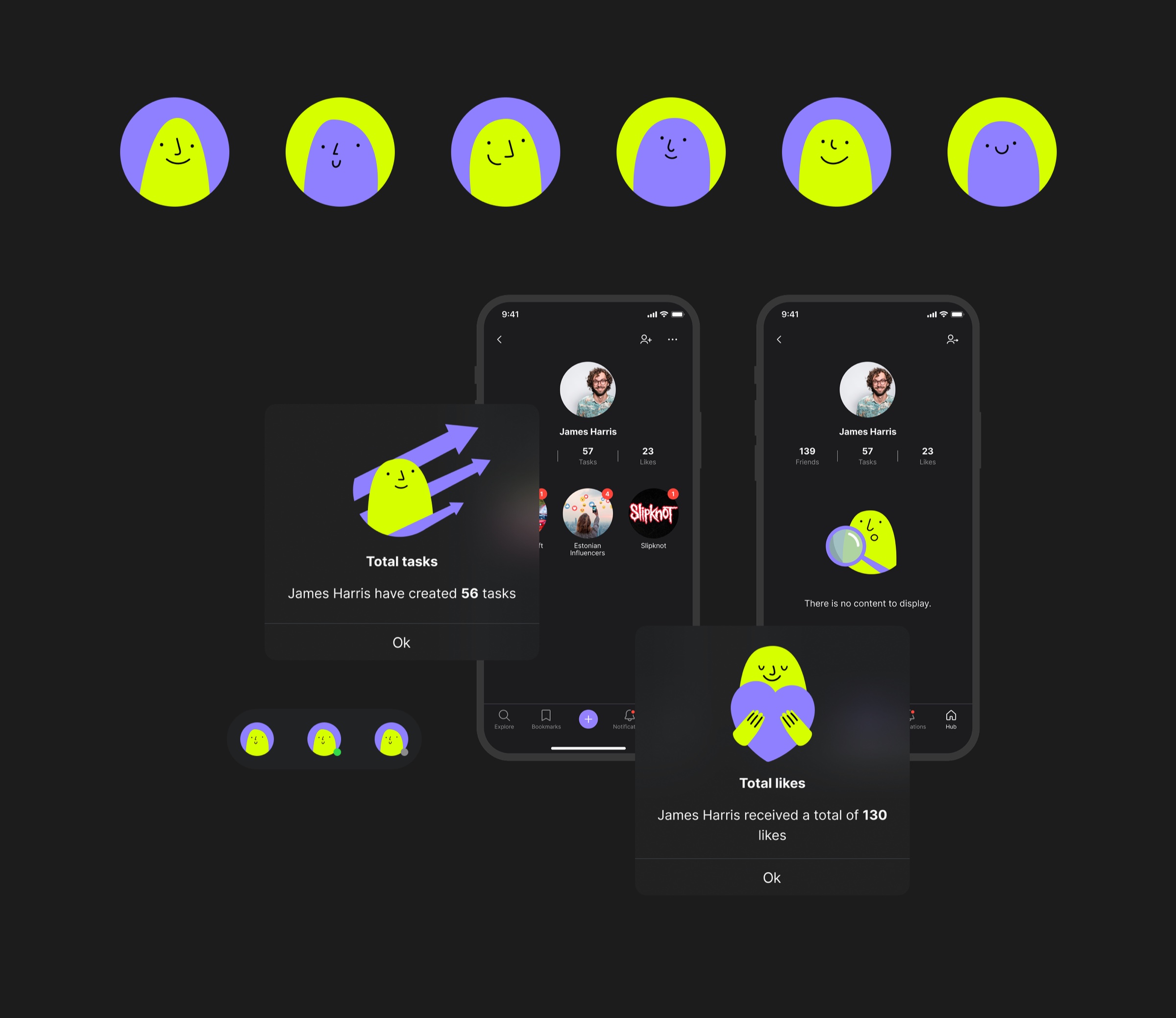
Introducing a mascot into the product was my decision, designed and illustrated by Andreas Vinkel. It lived in the app as a consistent character: guiding on empty screens, illustrating information on stat popups, always the same soft, permanent presence in an app built around disappearing content.
Circles: the pivot
Sequences alone didn't hold. Testing in the office, against the target persona, then opened to a small external group, surfaced two consistent pieces of feedback: there weren't enough people in a sequence to make it interesting, and once the novelty wore off, it got boring. What people kept asking for was something to keep coming back to, a group built around a shared interest or topic. That gap is what circles were built to close.
Circles came out of a working session between the founder, the PM, and me. The founder brought the idea of shared-interest groups, the PM added the concept of a task an admin could set, and from there it became a design problem: how do people join, and how does a circle behave differently depending on how open it is.
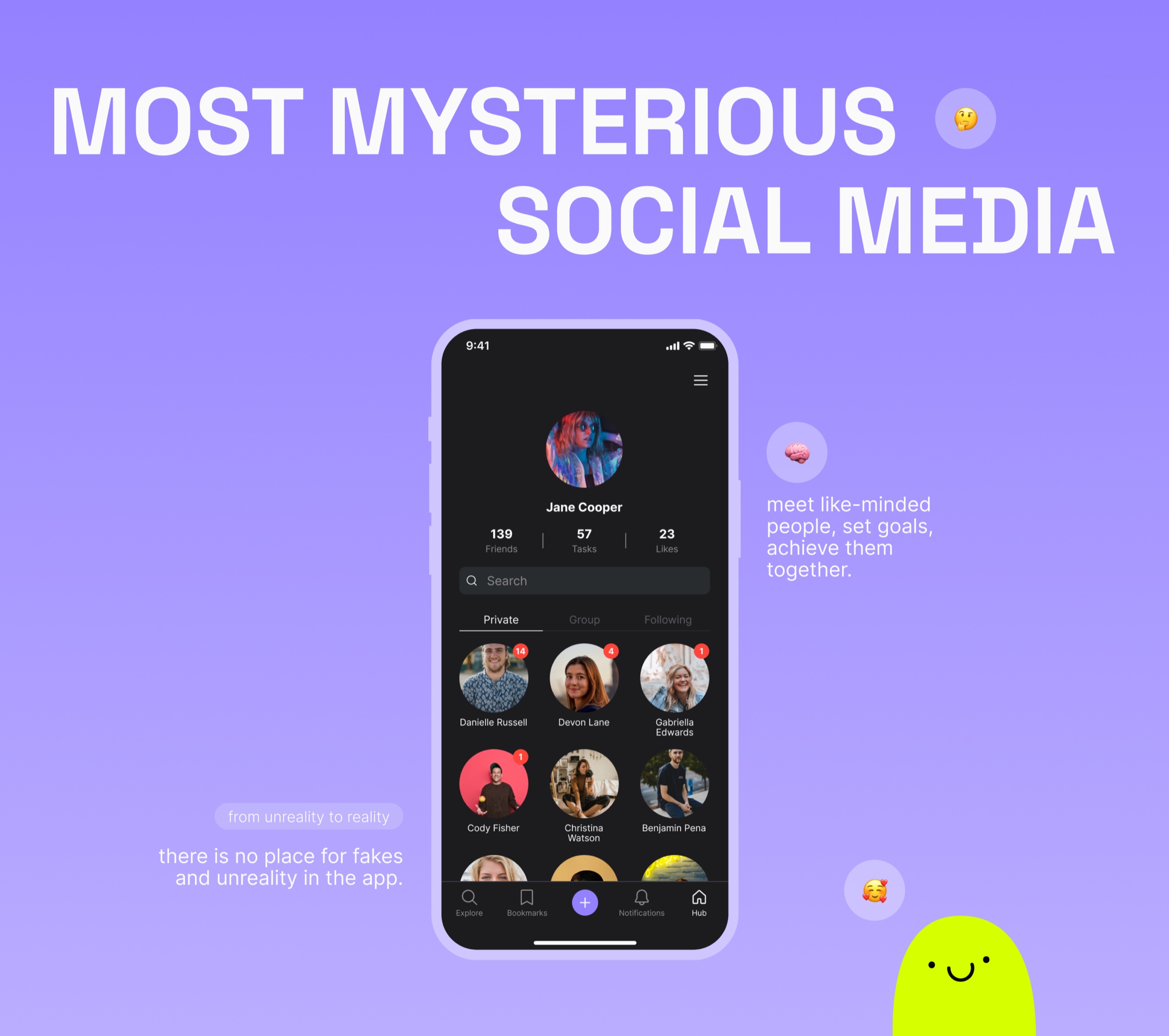
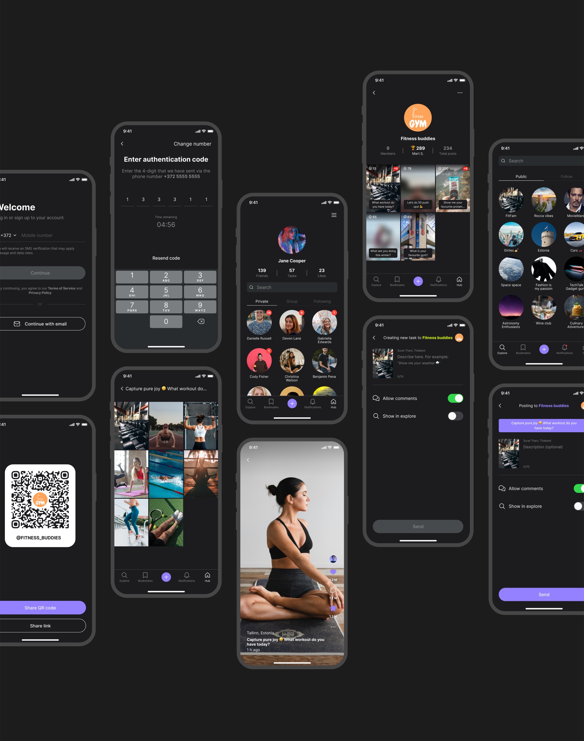
The result was three circle types. Private, one-to-one with a single friend, behaving like a regular sequence. Group, public and joinable, where an admin could set a prompt (the reading club example: "What are you reading today?") that turned into a shared gallery, everyone's photo laid out in a grid, with anyone who hadn't yet participated still shown blurred. Following, view-only, though still able to like, comment, and save to favorites.
A leaderboard number attached to each circle's top contributor was part of the founder's original brief and carried through into the final build.
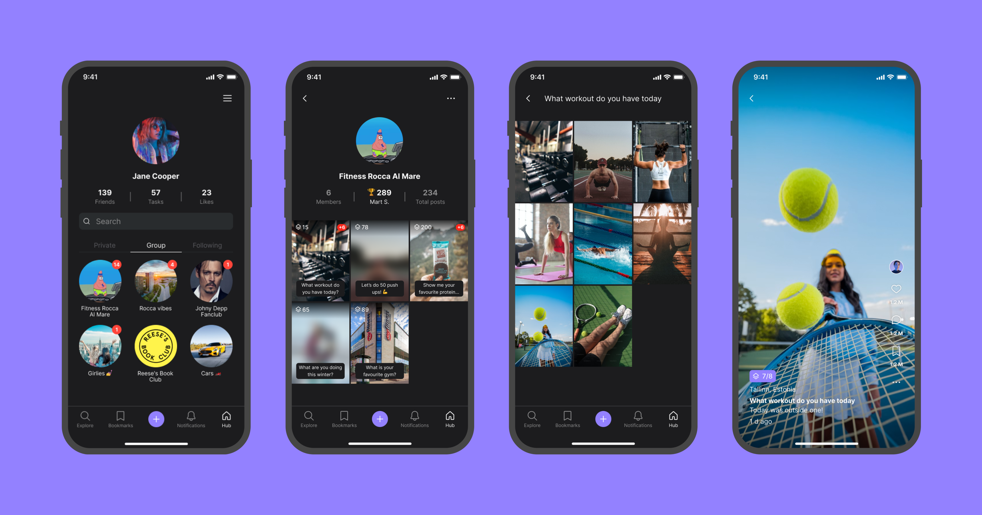
What made it into the final product
- Full capture flow: sequence-based posting, one-hour response window, front and back camera, zoom, and video capture
- Social layer: likes, comments, favorites, and sharing
- Friend system: add, remove, block, and invite to the app
- Circles: private, group, and following, with admin-set prompts
- Full profile system, including first-login empty state
- Notifications, covering comments, likes, friend requests, and moderation notices
This shipped as a complete app on both iOS and Android. Marketing materials and a live landing page followed.
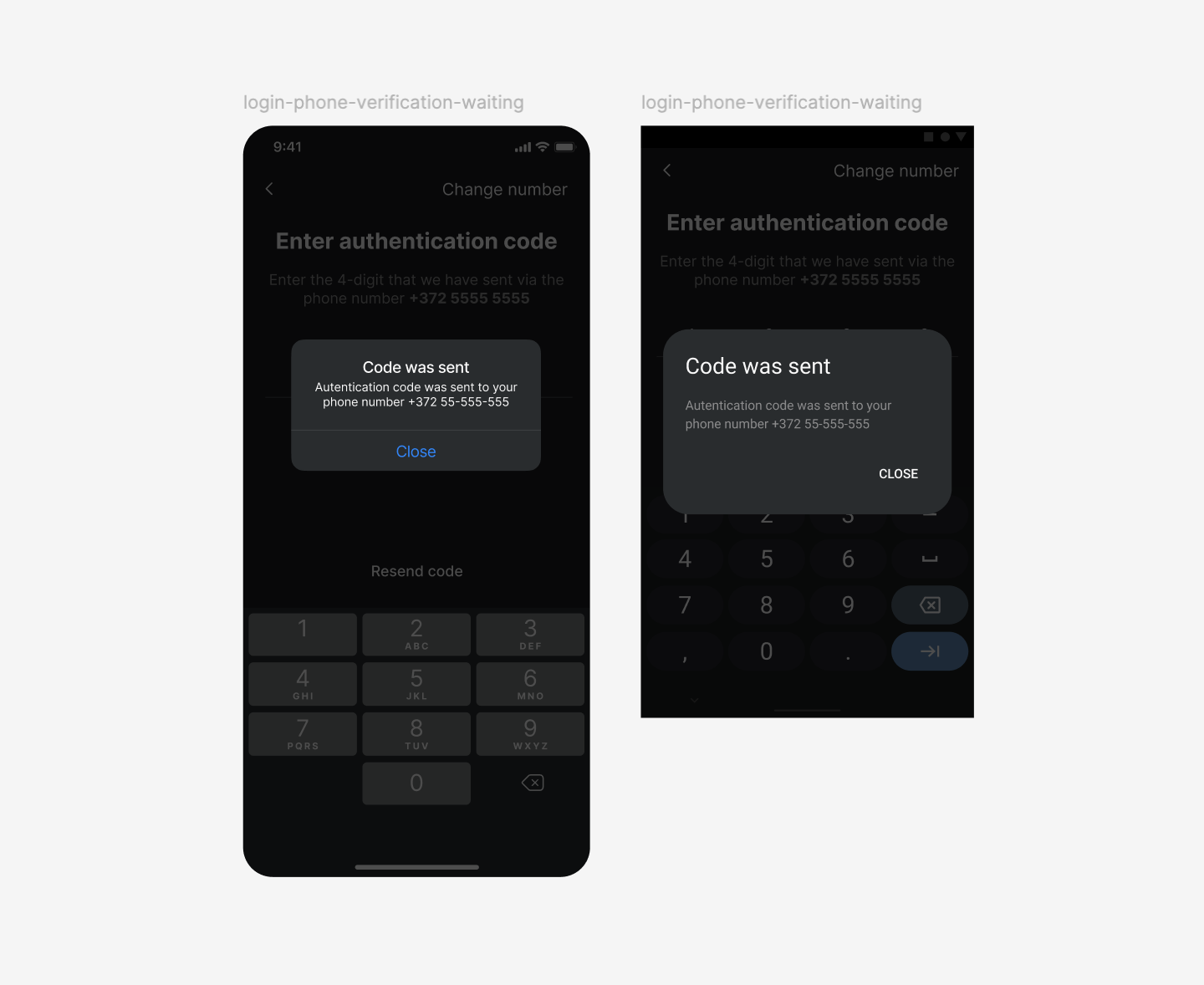
iOS and Android, adapted to each platform's native conventions
Where it is now
Sqence ran in the App Store and Google Play for several months before being discontinued and pulled from both stores.
The clearest lesson from this project is about timing. Getting real users onto the product earlier, even without a formal research phase, would have surfaced the boredom problem sooner and left more room to design for it before launch instead of after.
This case describes design decisions and product structure only. Business, financial, and internal process details are withheld per the terms of the project's confidentiality agreement.