Pleier for Postimees Grupp — one app for radio and podcasts
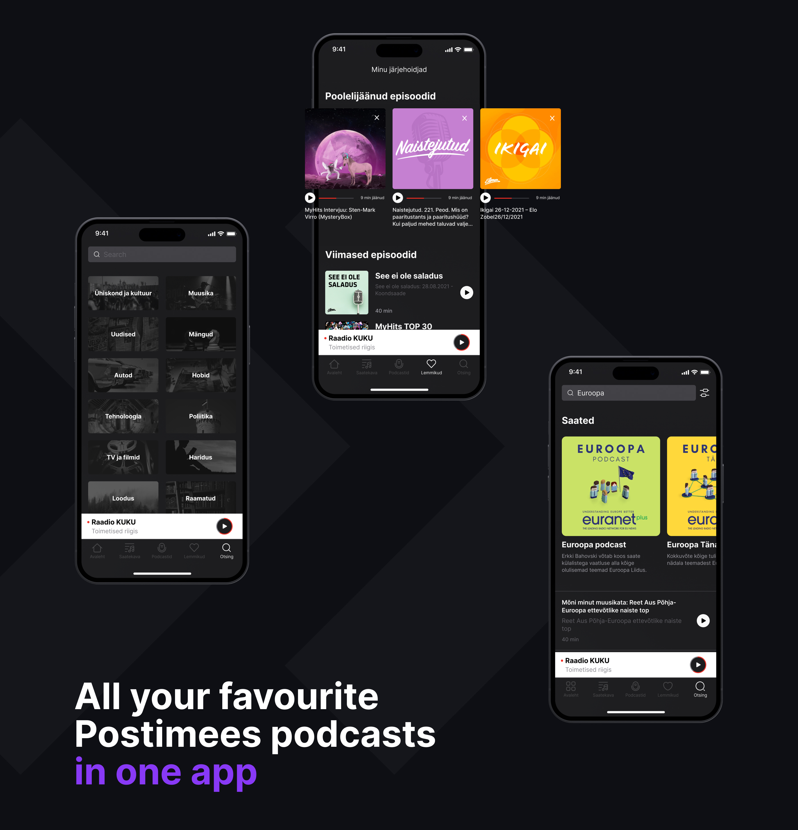
Postimees Group runs dozens of radio stations, podcasts and media projects. All of it lived in different places, on different platforms, under different rules. Pleier was built to be the single entry point: live broadcasts, show archives and podcasts from the whole group in one app.
Full product design from scratch, in collaboration with a product manager. User flows, wireframes, light and dark interface, and a design system underneath it.
Structure first
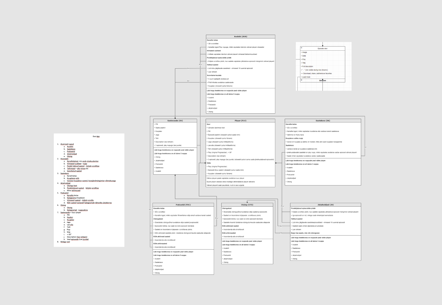
The app was mapped as a system with the product manager before any interface work: every screen defined by what it holds, every route agreed, every state named while it was still cheap to argue about.
Questions that usually surface halfway through design were settled on the map instead.
Borrowing on purpose
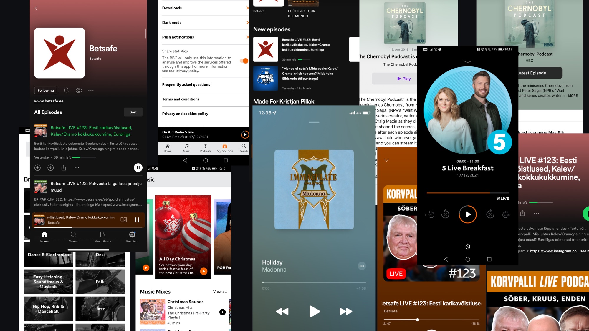
Dozens of radio and podcast apps were pulled apart before anything was designed. The conclusion was to invent as little as possible.
Nothing about a listening app should need learning. People arrive with habits formed by Spotify and Audible, and those habits are worth more than originality. So the podcast side deliberately follows the patterns people already carry: browse, subscribe, add to favourites, resume. Familiar was the goal, not a compromise.
Radio doesn't behave like a podcast
A podcast is something you go looking for. It sits in an archive and waits. Radio is the opposite. It's happening now, it isn't there later, and the only question a listener has is what's on.
So it was built as stories, an idea that came from the product manager and held up through the rest of the work. The format already carries the meaning: fresh, current, gone soon, scannable in a few seconds without commitment. Stations sit in a ring at the top of the home screen under a live marker. Scrolling through them brings each station forward in turn, and the one in focus shows what's airing on it right now.
The stories format arrives with a progress ring already attached, so it was given something real to report. A listener gets the station, the show and how long they have to catch it before making any decision at all.
Deciding what to listen to takes a swipe, not a screen.
The kit underneath
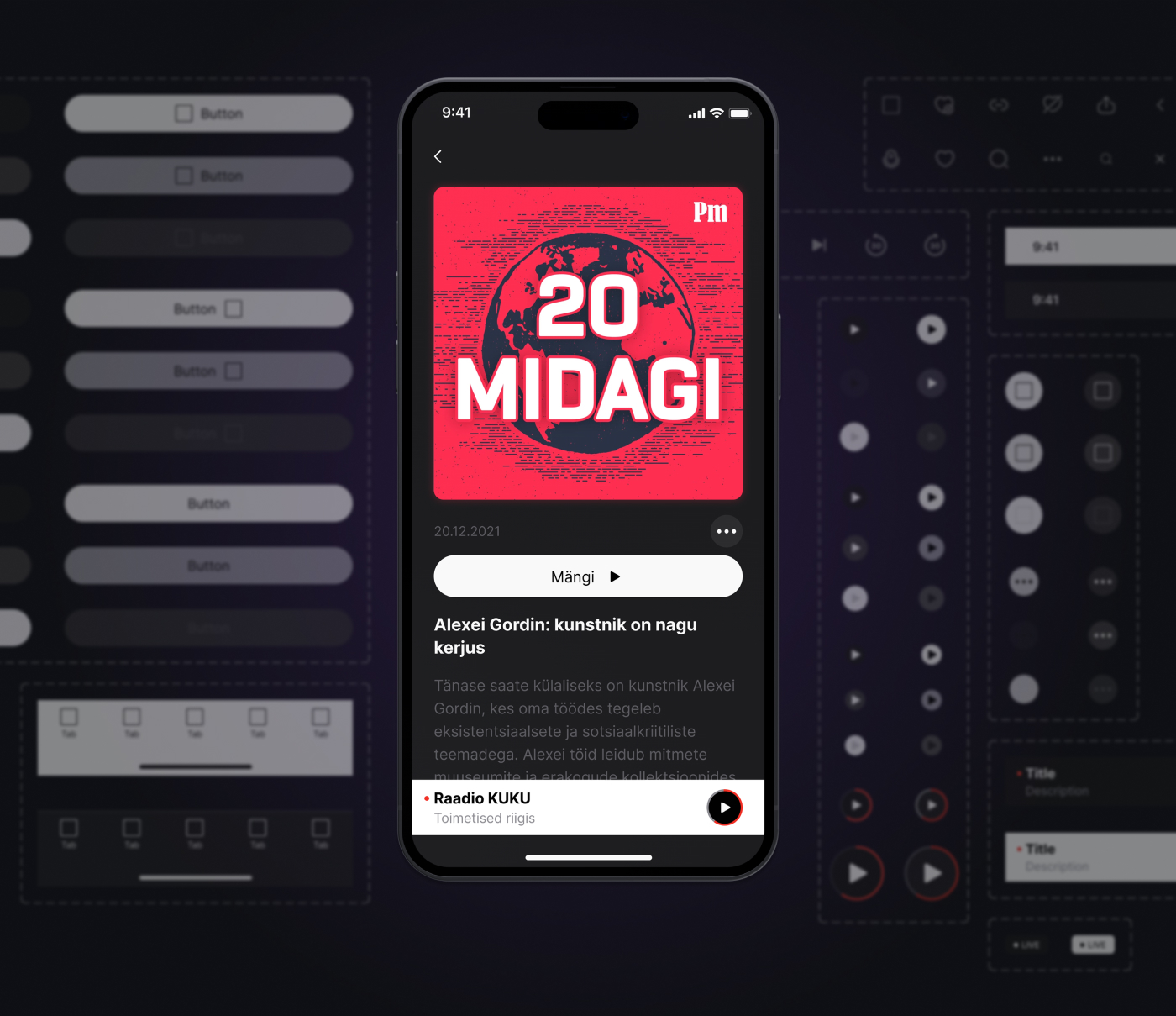
An app that pulls in content from across a whole media group has one structural problem: nothing arrives looking the same. Dozens of stations and shows, each with its own artwork, its own colours, its own logo lockup. The interface had to hold all of it without turning into a collage.
So the system was built to stay quiet. Neutral surfaces, one type scale, a small set of components carrying the content rather than competing with it. Light and dark run through the same components instead of two parallel sets, and the covers do the visual work, which is what a listener is actually scanning for.
One design served both platforms. Everything else was built once and reused.
Shipping
The launch window was short and the app went live without a formal testing round. The familiarity strategy was partly a response to that. When there is no time to test, the safest interface is one built almost entirely from patterns that have already been tested by everyone else.
Pleier launched on both platforms and is still in the stores. A few visual details have shifted since, but the structure the app launched with is the one it still runs on.