Spaceit MCS – Mission Control Software. Full product design of a cloud-based satellite mission control platform.
The problem wasn't a missing feature. It was a missing model.
Running a satellite mission used to mean stitching together five tools and ten contracts. Operators planned trajectories in one place, pulled telemetry from another, sent commands through a third. Every ground station on the satellite's path was a separate negotiation, a separate invoice, a separate integration.
Spaceit's bet was to replace all of that with one product and one subscription. One interface for the operator, one contract for access to a network of ground stations.
What was there
An MVP built feature-first by engineers, with no user logic underneath. The product knew what it could do, but not who it was doing it for.
I came in as the only product designer and stayed for three years. By the end I owned the design end-to-end across desktop, mobile, light, dark, and the system that holds it all together.
Talking to operators, not assuming
Products like this aren't built on guesswork. So interviews were run with operators across different mission types, returning to them throughout the project whenever a new module needed grounding. A space systems engineer who works closely with operators stayed on as a consultant from before I joined, and that line stayed open for three years.
What came out of those conversations sounded like this:
"Many tasks are manual, logging data, sending commands, analyzing telemetry. It's time-consuming, and everything is in Google Docs or CSV files. If something's off, we manually select and comment."
"We need immediate, configurable alerts that tell us exactly what failed."
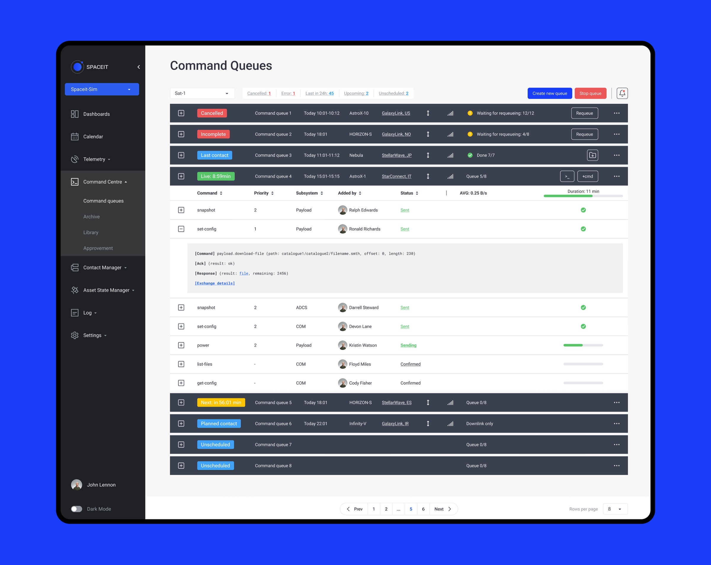
"Right now, there's no queue management, and we do it manually."
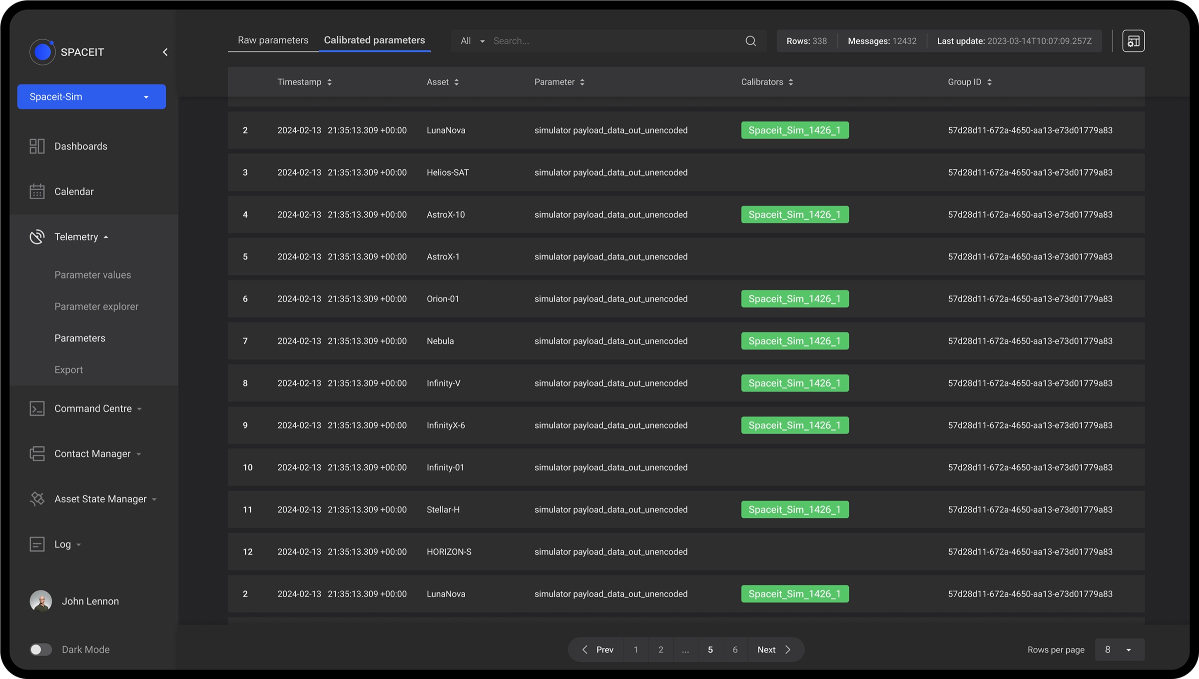
"There's no mission log, important events get buried in messages or files."
Usability testing the way most products do it wasn't an option here. You can't put a half-built mission control tool in front of a stranger and ask them to run a satellite. So testing meant prototypes in the consultant's hands, and the real validation came from clients flying actual missions on it.
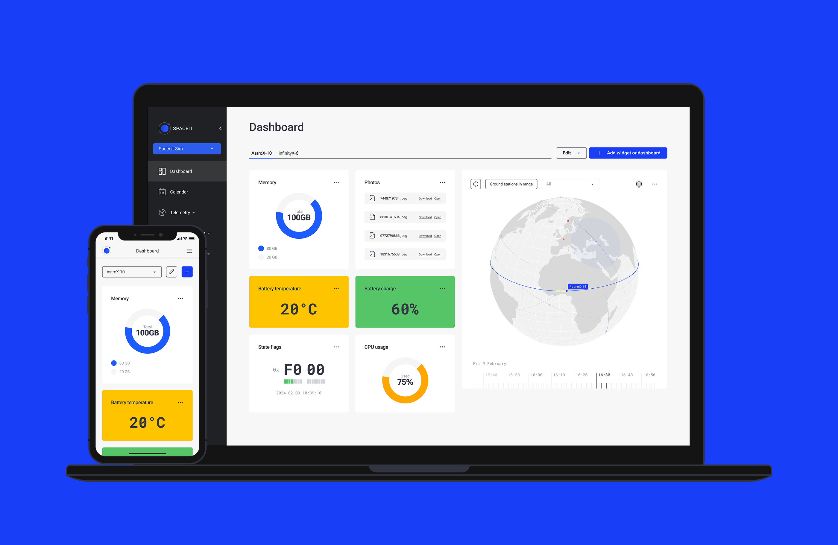
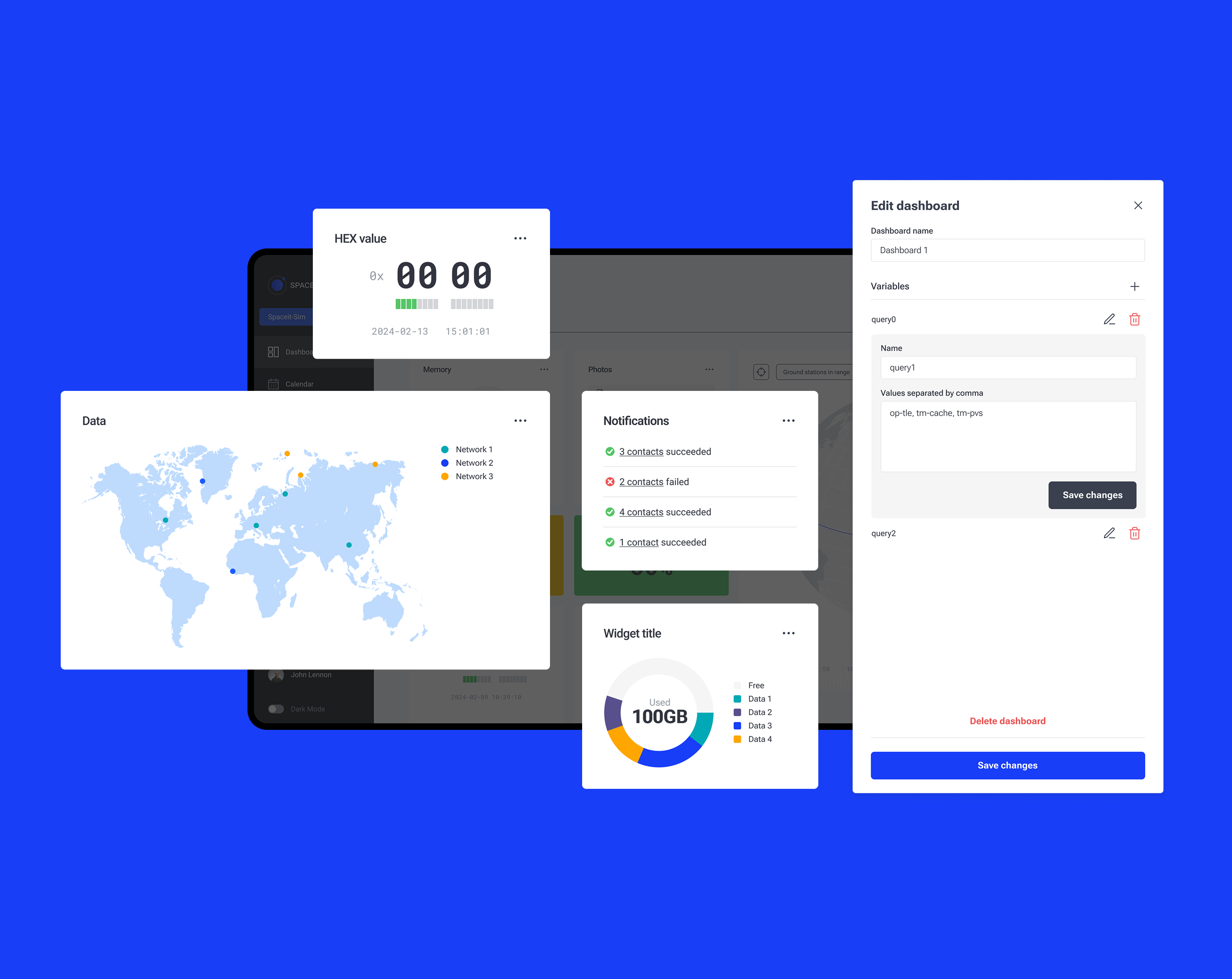
The core insight from those conversations: no two operators have the same setup. Mission types differ, priorities differ, even what counts as "the important number" differs. A fixed dashboard would've served no one. So we built a flexible widget system where operators assemble their own workspace around the parameters their mission actually depends on.
That insight set the tone for everything after. Build the surface, let the operator make it theirs.
How the work actually happened
Each module followed the same loop. Discovery with founders and developers, design, internal review, iterate. Three years, every module: dashboards, telemetry, command queues with approval flows, contact planning, asset state management with predictions, mission logs, settings, and so on. Most product decisions came out of those sessions.
The mobile call
Mobile wasn't a smaller desktop. It was a different question.
Operators don't plan missions on a phone, they respond to them. And not every mid-mission feature even needed to be there. The cut list was worked out with people from the space industry who run these operations daily. What stayed on mobile was what an operator actually needs in their hand when something is happening right now.
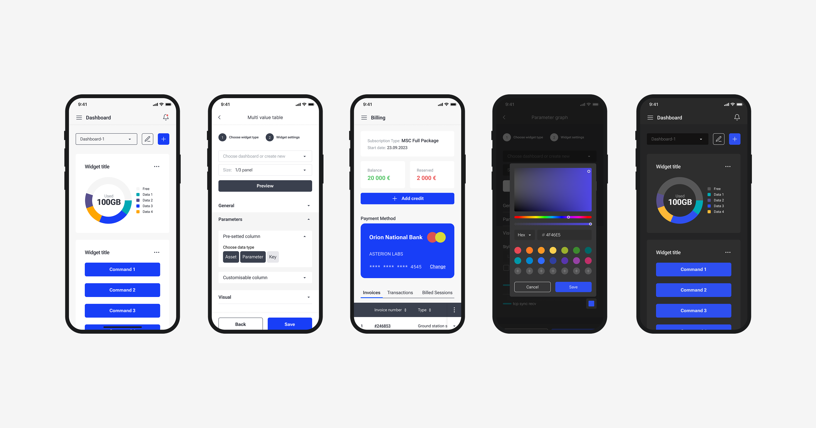
Dark mode shipped from day one on both platforms. Operators monitor satellites around the clock, often in rooms that stay dark on purpose.
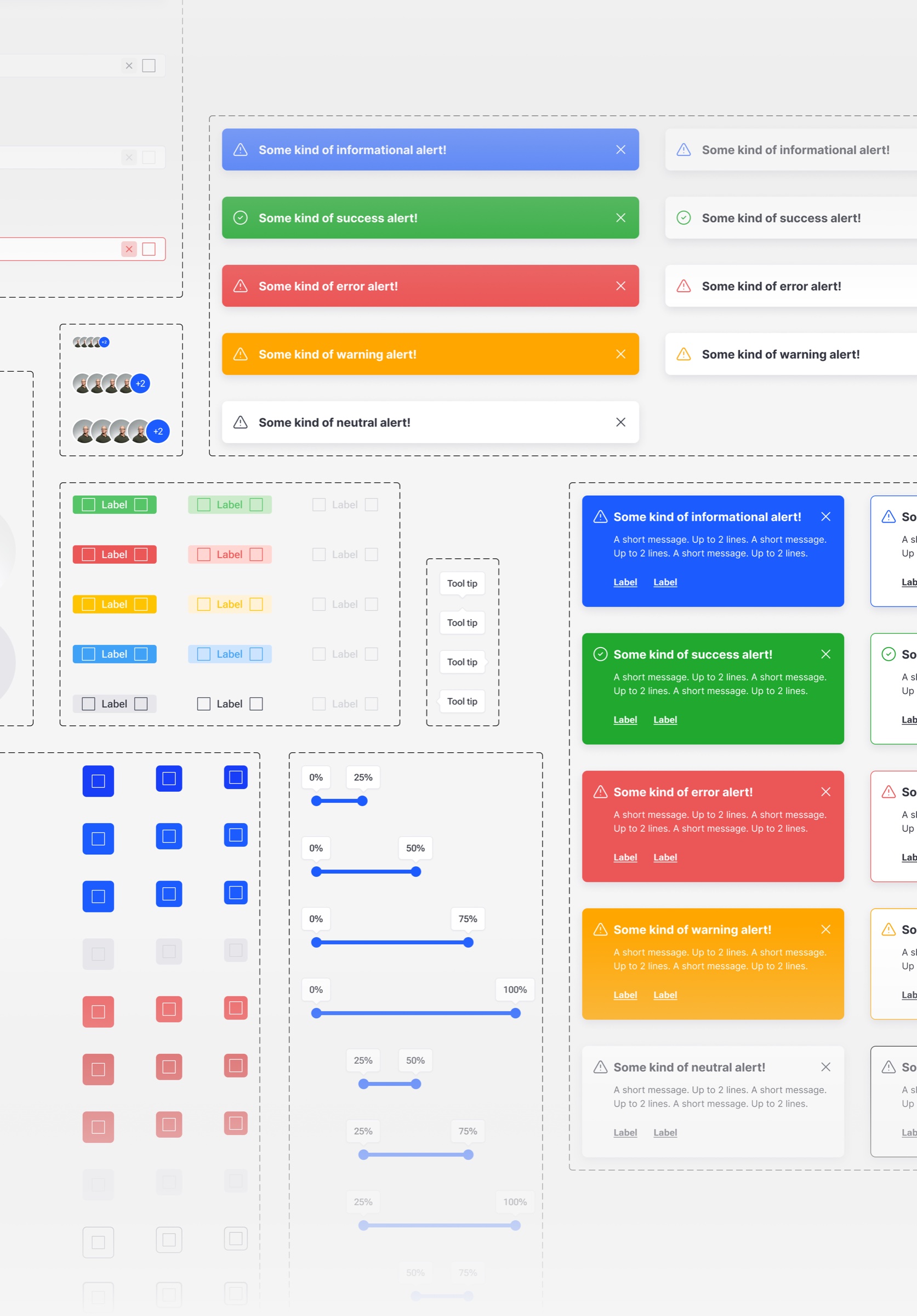
The system
A product this size needs a system. I built one from scratch, in parallel with the product, growing it module by module instead of trying to define everything upfront.
It covers desktop, mobile, and both light modes. From color and typography to the components doing the heavy lifting. It lives in Figma. I'm no longer on the team, but the front-end developer still ships from the same library.
Where it landed
The platform is live. Spaceit clients use it to run real satellite missions around the world. The product is in production, the system is in production, and the work continues.