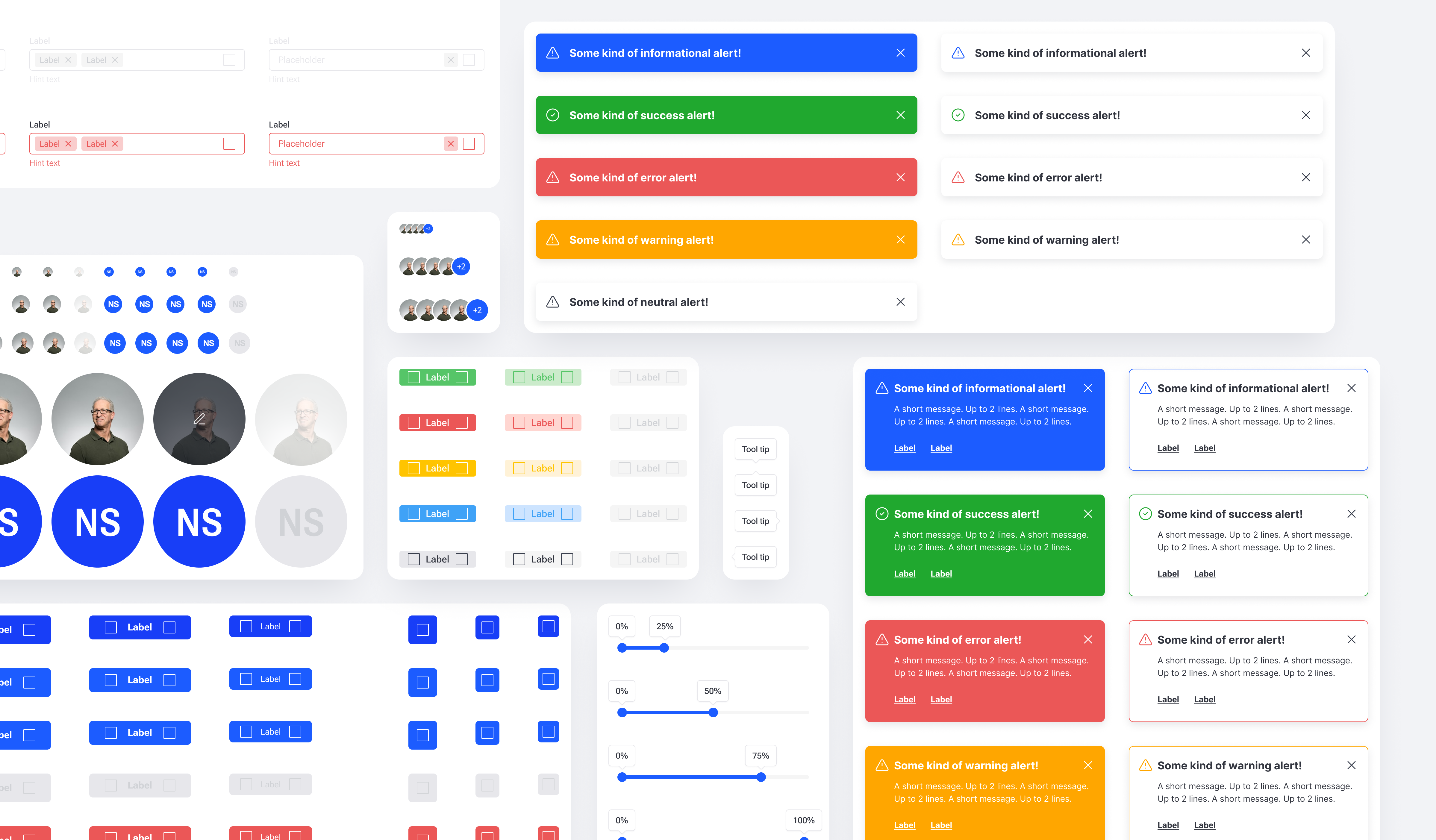
Spaceit MCS Design System.
Why a system, and why from day one.
The first time the product opened, it was clear it wouldn't survive the next module without a system underneath. Mission control software accumulates surface fast: dashboards, telemetry, command queues, contact planning, asset states, logs, settings. Each of those needs tables, alerts, modals, controls. Without a system, every module would re-invent the same pieces in slightly different ways, and the product would feel like five products stitched together.
So the system started before most of the product did.
How it's built
Atomic design, 8pt grid, all theming through component variants. Figma variables didn't yet support color or typography when the system started, so everything ran through styles. Themes (light and dark, on both desktop and mobile) lived inside component variants, not parallel files. One component, one source of truth, four faces.
The library is organised by category, not by module. Basics (colors, typography, icons), then the building blocks (avatars, buttons, labels, alerts, controls, inputs, dropdowns, date/time pickers, calendars, tables, data, modals, widgets, sidebar menu) for desktop. A parallel structure for mobile, with the patterns mobile actually needs: navigation bar, action bar, bottom sheets, rows. Components carry annotations and usage notes inside the file. The front-end developer worked from the same library, in parallel, and the production product maps to the Figma source one to one.
Widgets, the heart of the system
Operator dashboards were the original problem the system had to solve. Every operator configures their own workspace, so widgets had to be flexible without becoming unpredictable.
Flexible doesn't mean unlimited. Total freedom on a dashboard produces chaos: misaligned widgets, broken rhythm, layouts that look different on every operator's screen for no good reason. The system had to give operators real control without letting the dashboard fall apart.
The answer was a 12-column grid with widgets sized in fixed proportions: 1/4, 1/3, 1/2, 2/3, 3/4, and full width. Operators compose their dashboard out of these sizes, the rhythm of the grid stays intact, and the visual language of the platform stays consistent no matter how the workspace is configured.
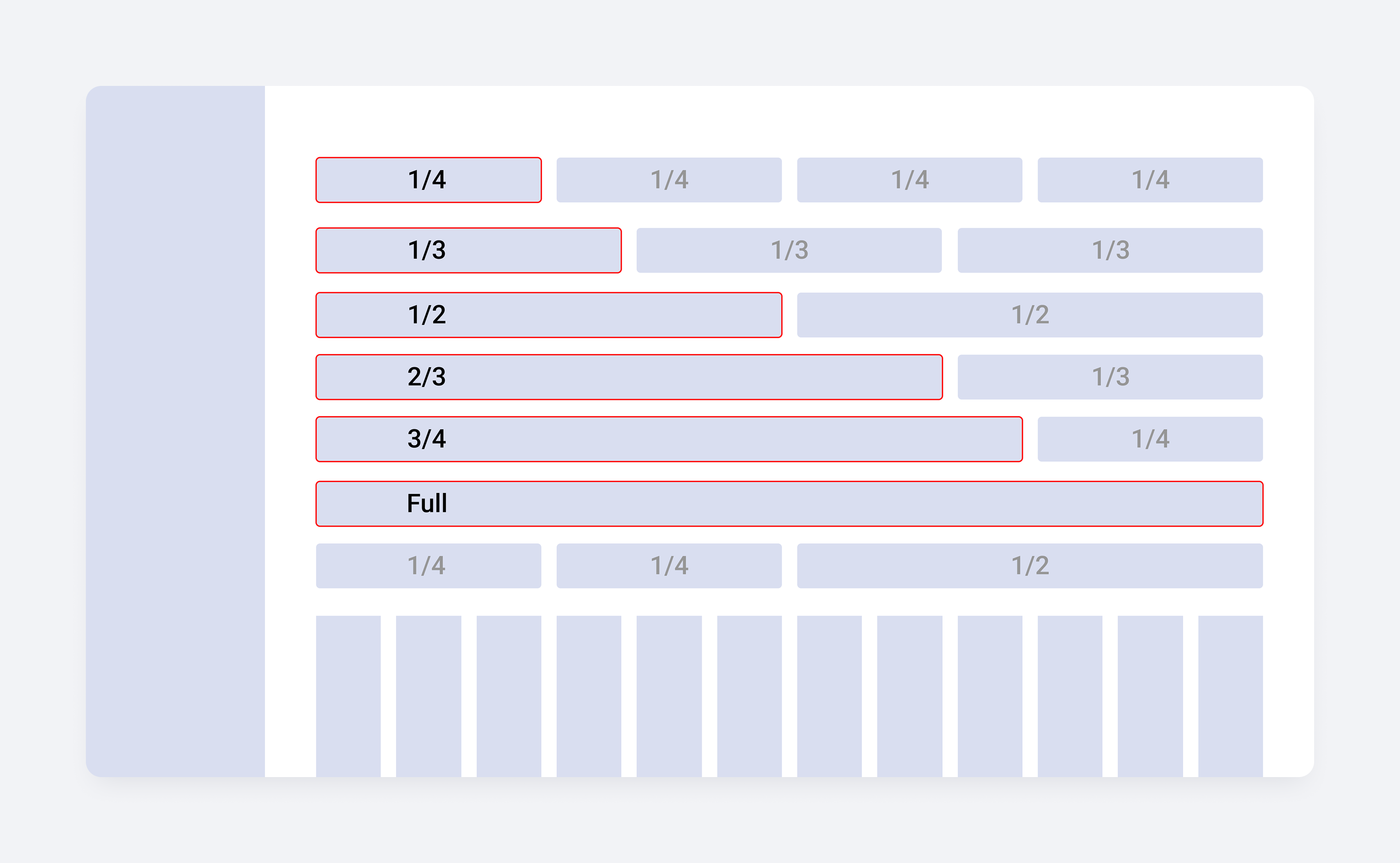
Each widget is a single component that adapts across the proportions it supports. A chart at 1/4 reads cleanly as a compact card. The same chart at full width opens up into a detailed view. Content reflows at each step, but it's the same component underneath, not six different ones.
Every widget has light and dark variants, and the catalogue covers the full operational range: status indicators, time displays, command panels, file lists, telemetry charts, polar plots, world maps, globes, activity feeds, and data tables.
The widget system is what makes the dashboard feel infinite to operators while staying finite for the team that builds it.

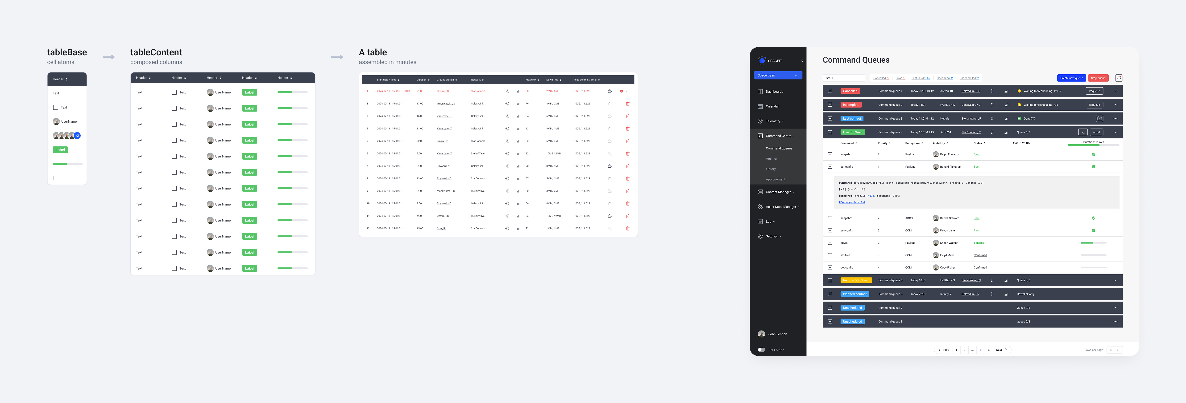
Tables, the workhorse
Mission control runs on tables. Telemetry streams, command logs, contact schedules, mission timelines. The tables in the system are data-heavy by design: sortable columns, mixed cell types in the same row (timestamps, asset names, status icons, avatars, response indicators, comment counts), dense and default densities, light and dark.
Tables sit inside the system as their own subsystem with a base layer (tableBase) and a content layer (tableContent), so a new table doesn't get built from zero. It gets composed.
The hardest part wasn't a component
The real challenge was building a system in parallel with a product whose scope kept expanding. Each new module brought a new question the existing components hadn't been designed for. A telemetry table behaves differently from a contact planning table. A command queue widget needs states a status widget doesn't. The system had to absorb new requirements without fragmenting, and every new module was a stress test of the decisions made in the last one.
That's why the library is organised the way it is. Categories, not modules. Components, not screens. The system had to stay legible to a single designer keeping the whole thing in her head while the product grew underneath it.
Working with development
The front-end developer built the coded system in parallel with the Figma library, not after it. Components got reviewed in both directions, and the production interface maps to the Figma source one to one. After three years, the front-end developer is still shipping from the same library, with no designer on the team.
What would change next time
Two things.
Tables would get more flexibility from the start. They're the most-used, most-strained part of the system, and the original structure made some configurations harder than they needed to be.
The system itself would be designed differently. Less "how do we make one component cover the maximum number of cases" and more "how do we make it easy to add a new component when the product needs one." Reusability is a virtue until it becomes a constraint.